There’s an old saying, which I’m sure you’ve all heard a million times before: “Never judge a book by its cover.”
However, as we wander through bookstores and absentmindedly browse, that’s exactly what we do. A cover acts as the first impression that a potential buyer will have of a book – it can leave a good impression, but it could just as easily leave a poor impression as well. In particular, a cover has the power to pique interest, to the point of being picked up, but it also has the power to leave a bad taste in the reader’s mouth. These sorts of bad impressions can lead a reader to make a split-second decision against the book based solely on the cover, even though the story itself might be phenomenal.
So, what exactly makes a book cover great? The process of creating a cover will look different depending on your publishing methods, and different genres often have different cover expectations and trends. With that in mind, I will be covering this topic in broad, generalizable strokes for the sake of time. So, let’s go over some fundamental components that should always be present in a cover, regardless of genre.
1.First, there’s the undeniable importance of having a clear and visible title.
This means, first and foremost, that the font should be professional and easy to read. For example, you should steer clear from fonts like comic sans because of their unprofessionalism, and also from overly stylized cursive because of how hard it can be to decipher.
Additionally, the color of the words should make the title stand out from the background rather than blend in. For example, a burgundy background with a plum title would be a bit too muddled. Think of the relationship between your background and title as a contrast between light and dark – this is exemplified quite well in the below examples.
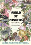
Both of these covers have different colors and designs going on in the background, which have the potential to distract from the title – however, the title stands out quite well because of the cover artists’ effective use of color contrast.
Aside from successfully employing legible font and contrasting colors, the two aforementioned examples also do a good job with their title’s sizing. Readers shouldn’t have to hunt for a title, and so the size of the font should help draw attention to it. When trying to determine whether a certain size is appropriate or not, think – if you saw the cover as a thumbnail on Amazon, would you be able to read the title from the thumbnail alone? Thumbnail legibility is incredibly important for covers, especially considering the prevalence of digital marketing and publicity, where life-size images of books aren’t available.
2. Second, it’s important to have a clear focal point rather than a busy, muddled mess.
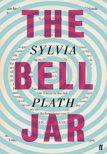
In other words, don’t overcrowd your cover with graphics that will overwhelm the reader. The Bell Jar, as pictured above, makes its title the clear focal point, as evidenced by the boldness of the title (i.e., size, color, placement). You can see the layers of the cover at work, with the title being the first thing to be noticed, then the author’s name, and then the art.
This isn’t the only way to prioritize a cover’s different layers, though. What it ultimately comes down to is a balance between artistry and simplicity. A cover must be unique and nice to look at, and yet it should not be overcrowded or complicated. Again, there needs to be a clear focal point. Take the following examples.
Both of these covers are gorgeous, and have a lot going on. Think about it – we see the author’s name, we see the title, we see the art, and we see a review. All of these pieces are floating around in the same space, and have the potential to overwhelm the reader. However, by employing different fonts, colors, sizes, and placements, the artists of these covers have successfully separated all of the different pieces and created a clear focal point.
With the World of Wonders example, the cover’s primary focal point is its title, which is framed beautifully by the art surrounding it (rather than being overshadowed by it). In particular, the title is clearly the darkest and boldest thing on the cover, so although the artwork takes up more real estate, it appears softer and lighter in comparison.
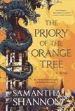
On the other hand, with The Priory of the Orange Tree, equal focus is given to the title as well as to the art (i.e., the dragon on the tower). Chances are, you’ll find your eyes flitting between the two. However, this isn’t a bad thing. The key to successfully employing this second method is to present the two separate pieces as being complementary rather than competitive – with this particular example, the art feels integral to the title, and the title feels as if it’s a part of the art. There is no difference of tone or style between the two, which results in a sense of cohesion.
3. Third, there must be consistency.
This means that, related to tone, there must be a consistent theme between the cover and the story itself. A cover reveals something about the book it represents, and a potential reader will make assumptions about the genre or tone of the story based on what they see on the cover. What this means is, there should be no mismatching in theme between the story and the cover that represents it. Remember, the cover is a metaphorical sales pitch of the book. Take the following example.
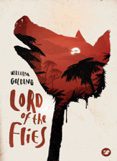
Lord of the Flies is a book about paranoia, violence, and survival. It follows a group of children who have been stranded on an island and slowly start turning against each other, stooping to levels of depravity that seemed impossible for them at the beginning of the story. This cover, firstly, is beautifully composed, and secondly, successfully captures the unsettling tone of the story via its imagery. We see 1) the pig, which holds significance in the story, 2) the tropical scenery within the pig, which helps reveal the story’s setting, and 3) the fixation on red, which is reminiscent of blood and violence.
It’s also important for a cover to stay true to what the focus of the book is on. If, for example, you’ve written a space opera with an incredible eye to environmental detail, you may want your cover to focus more on conveying the sci-fi environment than on introducing a particular character. However, if your book is very much focused on the romantic journey of your sci-fi characters, but your cover heavily features spaceships, then your reader might be disappointed (since the cover led them to expect an environment-focused story). Take a look at the following examples.

With the first example, My Dark Vanessa, the cover focuses on a young girl’s face. This is an appropriate focus, since the story is a psychological thriller about the trauma of a young girl – the story orbits around her, and so it makes sense for her to be heavily featured on the cover.
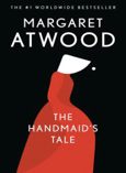
Then we have The Handmaid’s Tale, the cover of which focuses on a handmaiden (i.e., a designated child-bearer in a dystopian, sterile future). This is an appropriate focus, because the story orbits around the themes of oppression, manipulation, dogma, submission, and other such things, with the handmaidens being the clear victims of such abuse (and so best embody the aforementioned themes). While there is a clear main character in the story (who is herself a handmaiden), it makes more sense to introduce her situation than to introduce her as an individual, especially given the dystopian / situational nature of the story.
Again, the topic of covers has been dealt with in broad strokes here, so we’re really only just scratching the surface. However, although this may have been basic, I hope that it has been helpful nonetheless, since the different components covered in this piece are applicable across genres.
Below are a couple things to remember before you go. First, the different components of what make a cover great often overlap and inform one another. For example, the sizing / formatting of your title (i.e., #1) will help inform what the cover’s clear focal point is (i.e., #2), with the composition and imagery of both facets bleeding into the consistency of tone / focus between the cover and the story itself (i.e., #3). Everything is connected, and a weakness in one area will negatively impact the others.
Second, the most fundamental way you can learn about what works and doesn’t work with covers is by going out and actually observing different types of covers. As you walk through a bookstore, which ones pull at you? Which ones repel you? Which ones get you to pick up the book and look at the blurb? As you expose yourself to various covers from various genres, reflect and ask yourself what works, what doesn’t, and why. Then, if you ever find yourself in a situation where you need to give your own story a cover, you won’t be going into it blind – you’ll already have an idea of the basics, and you’ll also feel confident in what your own personal preferences are.
[cm_page_title title=”Continue Reading” subtitle=” Shelf Unbound”]
Article originally Published in the April / May 2021 Issue: Cover Stories.